Colour glass splashbacks are a simple way to add personality to a kitchen without changing the entire layout. They protect the wall while bringing in a clean, modern surface that is easy to wipe down.
The main challenge is choosing a shade that fits with worktops, tiles, and appliances without making the space feel busy. A good match creates flow, while a poor match can make even an expensive kitchen look unplanned.
Choosing a colour that works with your worktop

When selecting colour glass splashbacks, start by looking at your worktop in daylight and in evening lighting. Worktops often have undertones that only become obvious when placed next to a strong colour.
If your worktop is busy with pattern, such as marble effect or speckled stone, a calmer splashback colour usually looks best. Soft whites, warm greys, muted greens, or gentle beige tones can support the pattern rather than fight it.
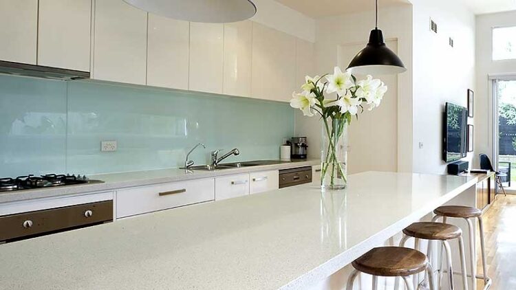
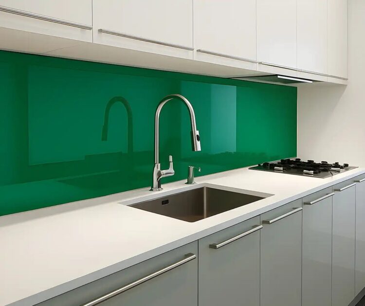
For solid worktops like quartz in plain white or black, you have more freedom to add contrast. Deep navy, forest green, or even a strong terracotta tone can create a striking feature without overwhelming the room.
Try to balance temperature in the palette. Warm wood or warm-toned stone pairs better with creamy neutrals, olive greens, or earthy colours, while cool grey worktops often suit crisp whites, blue tones, and charcoal shades.
How to coordinate with tiles and existing wall finishes
Some kitchens use tiles in certain areas while leaving other walls plain. In that case, colour glass splashbacks should connect to the tile choice rather than compete with it.
If you have patterned tiles, let the tiles lead and choose a colour from the pattern for the glass. This can be a background shade from the tile design, which helps everything feel intentional and coordinated.
For plain tiles, consider whether they look cool or warm, and match the glass accordingly. A cool white tile next to a warm cream glass panel can look slightly off, especially under bright LED lighting.
Also think about grout lines and texture. Glass is smooth and seamless, so it can look very modern next to rustic tiles, which can be a great contrast if it is planned carefully.
If you want the kitchen to feel larger, use a light coloured splashback that blends into the wall. If you want a feature, choose a deeper colour and keep surrounding surfaces simpler.
Matching appliances, metals, and small details

Appliances create strong visual blocks in a kitchen, so they should be part of the colour plan. Stainless steel works with almost any colour glass splashbacks, but it looks especially sharp with cool tones like grey, blue, and crisp white.
Black appliances pair well with rich colours and strong contrast schemes. Black ovens and hobs can look striking against pale glass, but also feel seamless against darker shades like charcoal or deep green.
White appliances can be trickier because they can look slightly yellowed next to very bright whites. If your appliances are white, consider a softer off white or a gentle neutral to avoid harsh comparisons.
Do not forget the smaller metal finishes such as taps, handles, and light fittings. Brushed brass tends to suit warm colours like beige, sand, and muted green, while chrome and brushed steel often suit cooler palettes.
Lighting makes a big difference, especially under cabinet LED strips. Test samples in the kitchen at different times of day, because a colour that looks perfect in sunlight can shift under warm or cool artificial light.
Conclusion
Colour glass splashbacks can look effortless when the colour choice is linked to the worktop, tile tones, and appliance finishes. The goal is to create a palette that feels balanced in both daylight and evening lighting.
By checking undertones, coordinating with patterns, and considering metal finishes and appliances, you can achieve a clean, modern kitchen that feels cohesive and thoughtfully designed.
